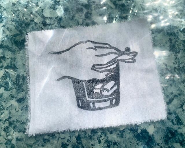
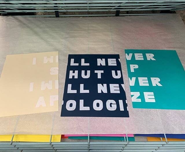
ALPHABET STUDY
This font was hand-cut, using two inch by three inch rectangles as the template for each letter. These individual cut paper letterforms served as a stencil for a screen print, which was then printed in six different colors and cut into individual letters.
Commissioned by Waiting Room for their 2020 Sweetheart Market for use as a backdrop for their polaroid photo booth.
TERMINATION DUST LOGO
Alaska-based band Termination Dust was seeking a playful design that could be used on show flyers, as well as printed on t-shirts. The play on bubble letters is adapted from the Alphabet Study found further up this page.
Typeface and illustration designed using Adobe Illustrator.


GRANDDAD ALBUM ART
Minneapolis band Granddad had the image of a forlorn, empty parking lot paired with the typographic graphic style of early 2000’s indie rock covers in mind with their j-card design for their album What Happens After.
This process began with creating the photography, manipulating it to appear hazy and dim in Adobe Photoshop, then adding the graphic elements in Adobe Illustrator.